


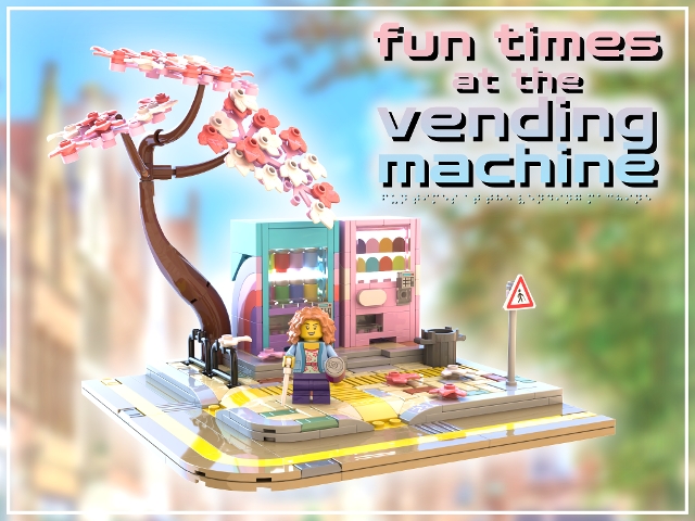


The Vending Machine, My Faithful Friend
Back when I was a student, I had one lecture a week at the university's dedicated art campus. It was a bit of a trek to get to; I had to ride the metro for nearly an hour, leaving the big city behind, to reach the rural art building. It was a converted colonial military base, and was an absolutely beautiful place, with rustic scenery unlike anything else in any of the university's buildings - plus a giant sculpture of a robot made from scrap metal on one of its lawns.
The weather there was somehow always perfect; bright and sunny and hot. As this lecture was so out of the way, I'd often arrive early and take the opportunity to sit back and enjoy the scenery for a bit. It was the perfect way to get my creative juices flowing ahead of my lecture.
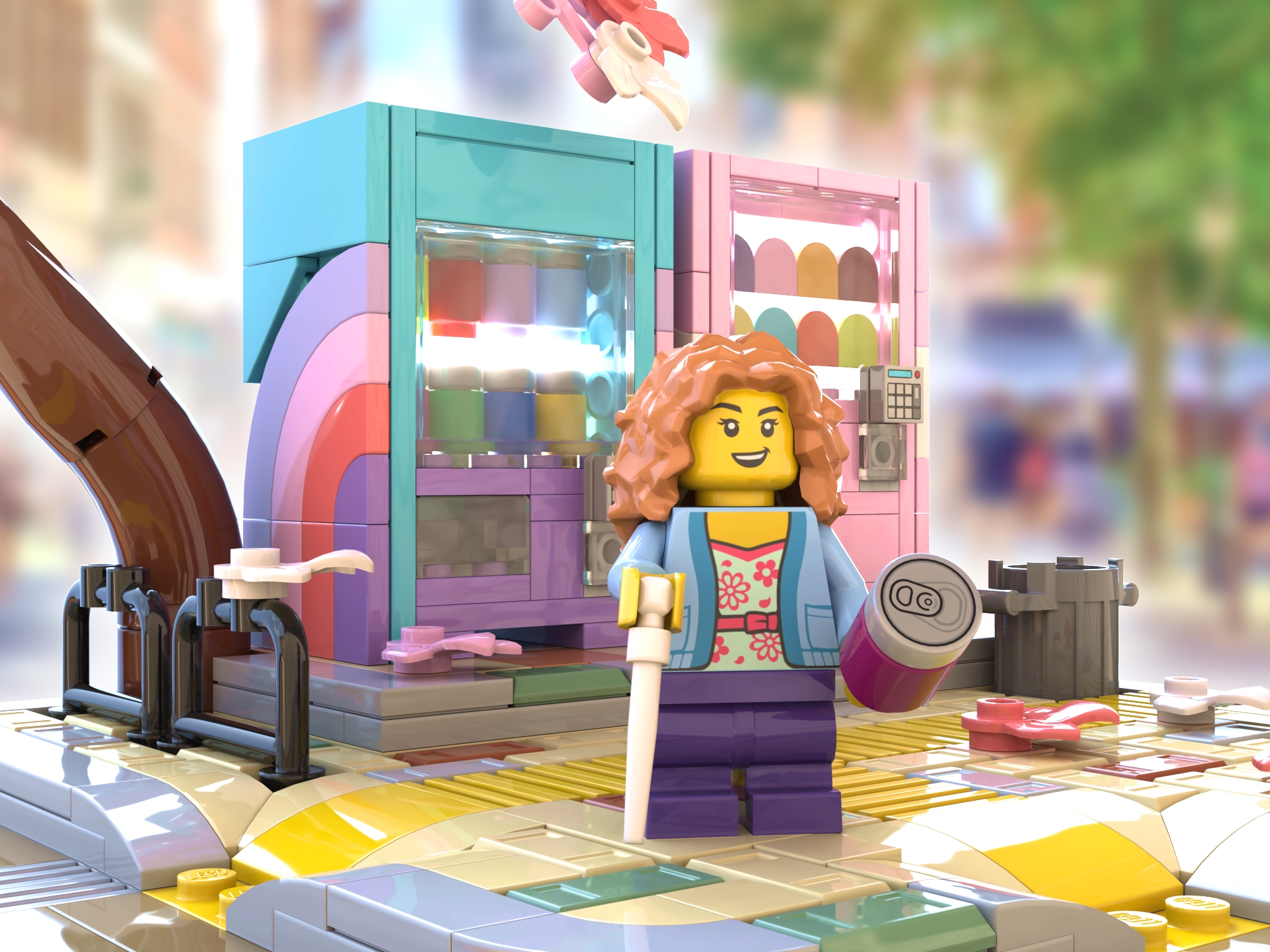
Inevitably, though, I'd end up feeling hungry. I have a bad habit of skipping lunch. Apart from a group of tower blocks, there was nothing else in the area, so the only place to get a snack was, naturally, the campus vending machines. I can still remember my regular purchase - jalapeno pretzel bites and a can of fizzy orange drink.
It's such a simple memory: putting coins into a slot (or just beeping my card) and waiting for the whir of the machine as it dispensed my order. Simple as it may be, though, it's beautiful to me, and I wanted to recreate the bright, breezy, sunny memories in LEGO form.
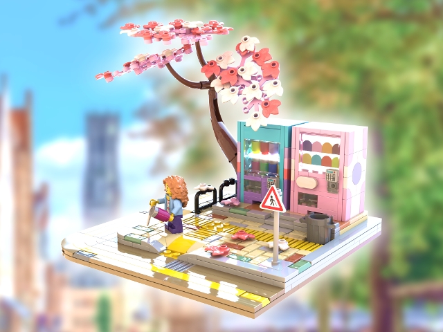
Accessible for All
I didn't deliberately set out to create a LEGO model that provides representation for the visually impaired. This simply happened naturally as a result of wanting to create a reflection of the world around me.
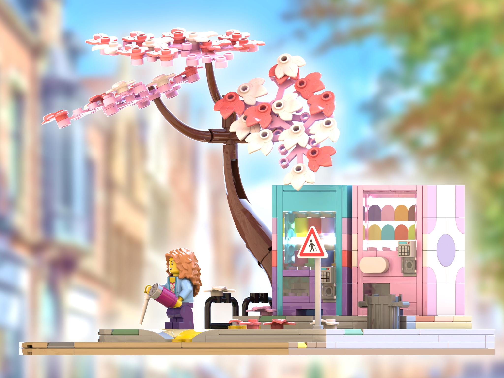
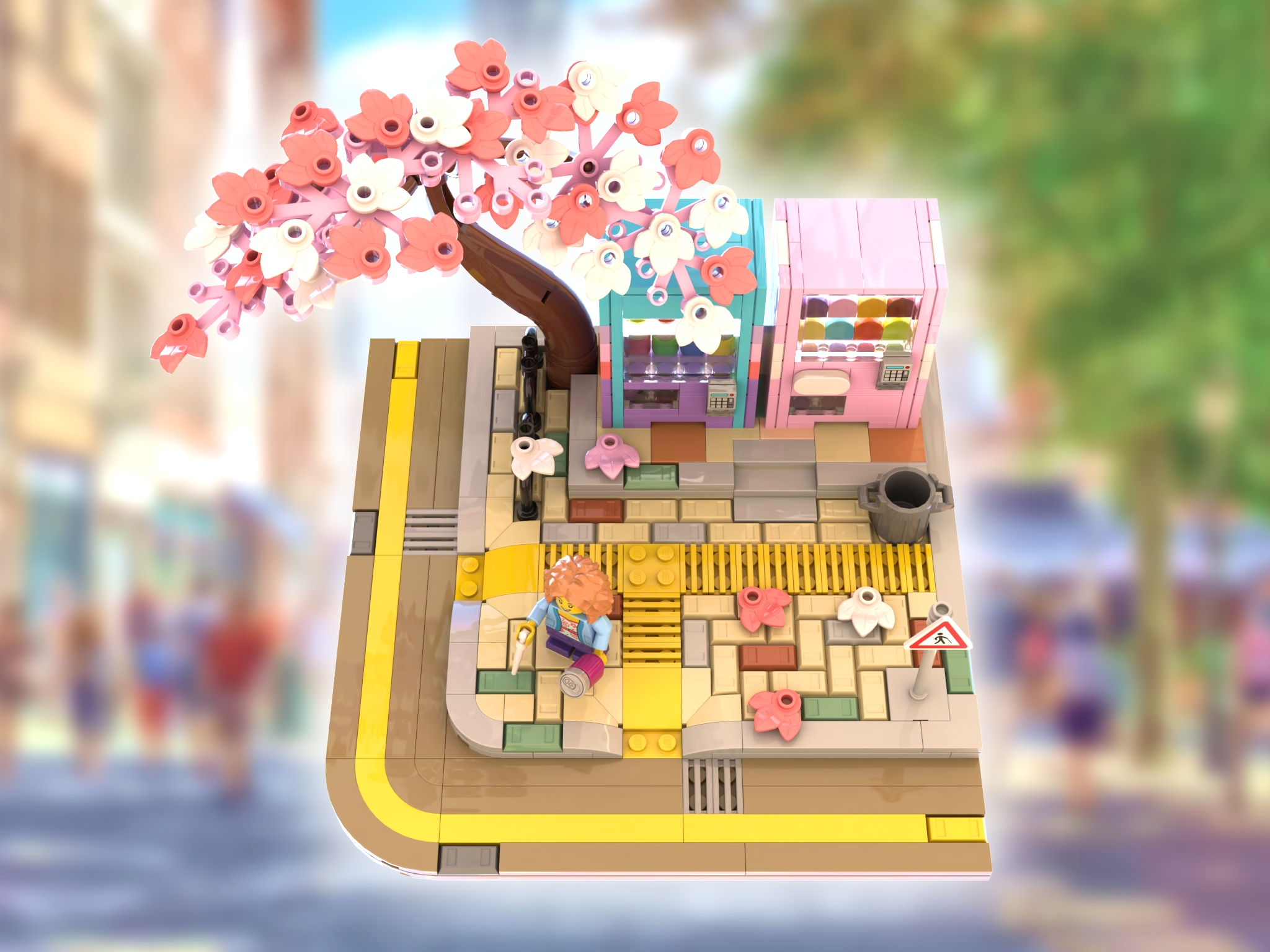
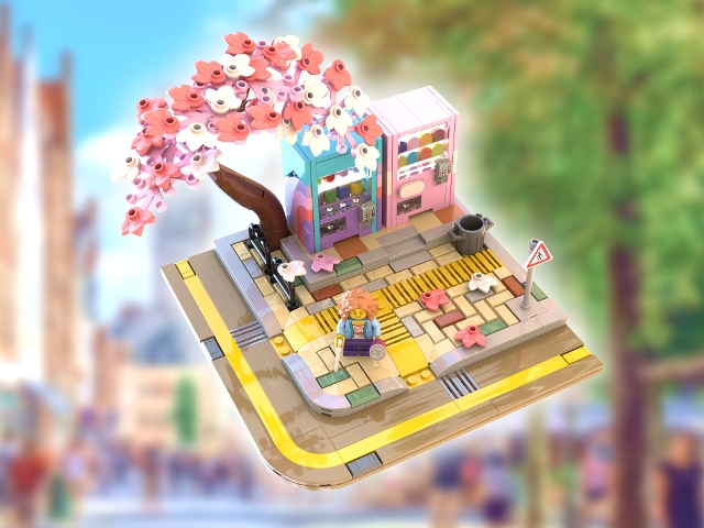
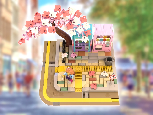
I figured that if I was going to make a little scene with a couple of vending machines, it would be nice to include bright yellow tactile pavement and dropped curbs. I tried half a dozen different ways to achieve this, assuming initially that some Studs Not On Top solutions would be best, before ultimately discovering that the simplest solution was significantly more visually appealing. To that end, I'm rather proud of the floor of this design; I doubt many LEGO models have quite as much thought put into the paving slabs underneath the minifigures' feet.
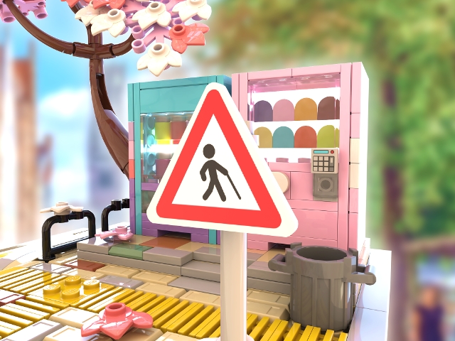
Somewhere along the way I had the idea that, since this project features such prominent tactile paving, it would be appropriate to reference this with the minifigure as well. I initially had my heart set on a face printing that unfortunately wasn't included in the Series 7 palette (one with big round glasses which I thought would be a useful representation of vision impairment) but I settled on a white cane that hopefully provides some additional representation in this model.
The last thing I designed was the set's one sticker: I knew that I wanted a roadsign in the set, and it made perfect sense to tie everything together by making it another reference to vision impairment. To my knowledge we've never had a sign like this in LEGO form before, so I'm hopeful that this will help some members of the LEGO community feel better represented.
A Life Full of Colour
In designing this model, I wanted to create a compelling, bright, and sunny colour scheme. I wanted conjure up the image of vending machines and pavement that's dappled by warm sunlight, and the best way to do this, in my opinion, was to use some bright and particularly vibrant brick colours.
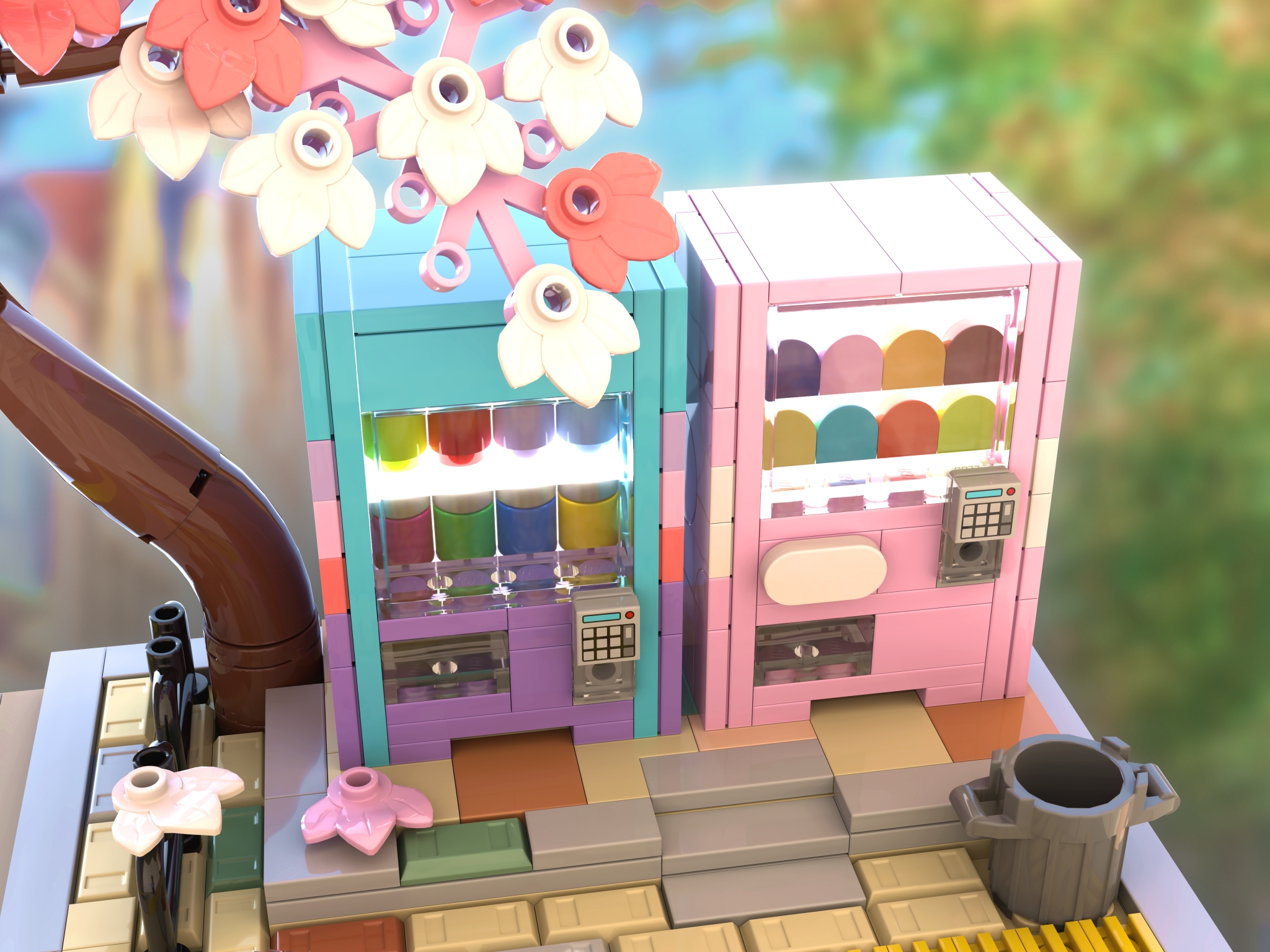
The vending machines themselves were an obvious opportunity to make things colourful. I tried a bunch of different colour schemes and designs for the sides of the vending machines before I settled on some nicely contrasting blues and pinks. I wanted to provide a slight hint of Eighties aesthetic here - hence the curved stripe on the blue vending machine.
The tree's pink and white leaves are no accident, I'm hoping that they give the set a springtime vibe and, ideally, will call to mind certain charming Japanese animated films. The art styles for some of these movies dramatically influenced this design, although I've also sought to make this model feel universal, as if it could be any sunny street corner anywhere in the world.
The colours for the pavement are a particular highlight in my opinion. I used tan and dark tan where most official LEGO sets use dark and light grey, in order to inject in a little more warmth. I enjoy how the tan elements contrast with the occasional grey, green, and brown paving, to help this little scene feel all the more full of colour and life.
How well this is all actually communicated is difficult for me to tell, all I can say is that I'm very proud of this design. I set out to create a charming little scene using as few bricks as possible, and I'm eager to hear all feedback that fellow LEGO fans can give me. Thanks for reading!


You've reached the end of the comments.